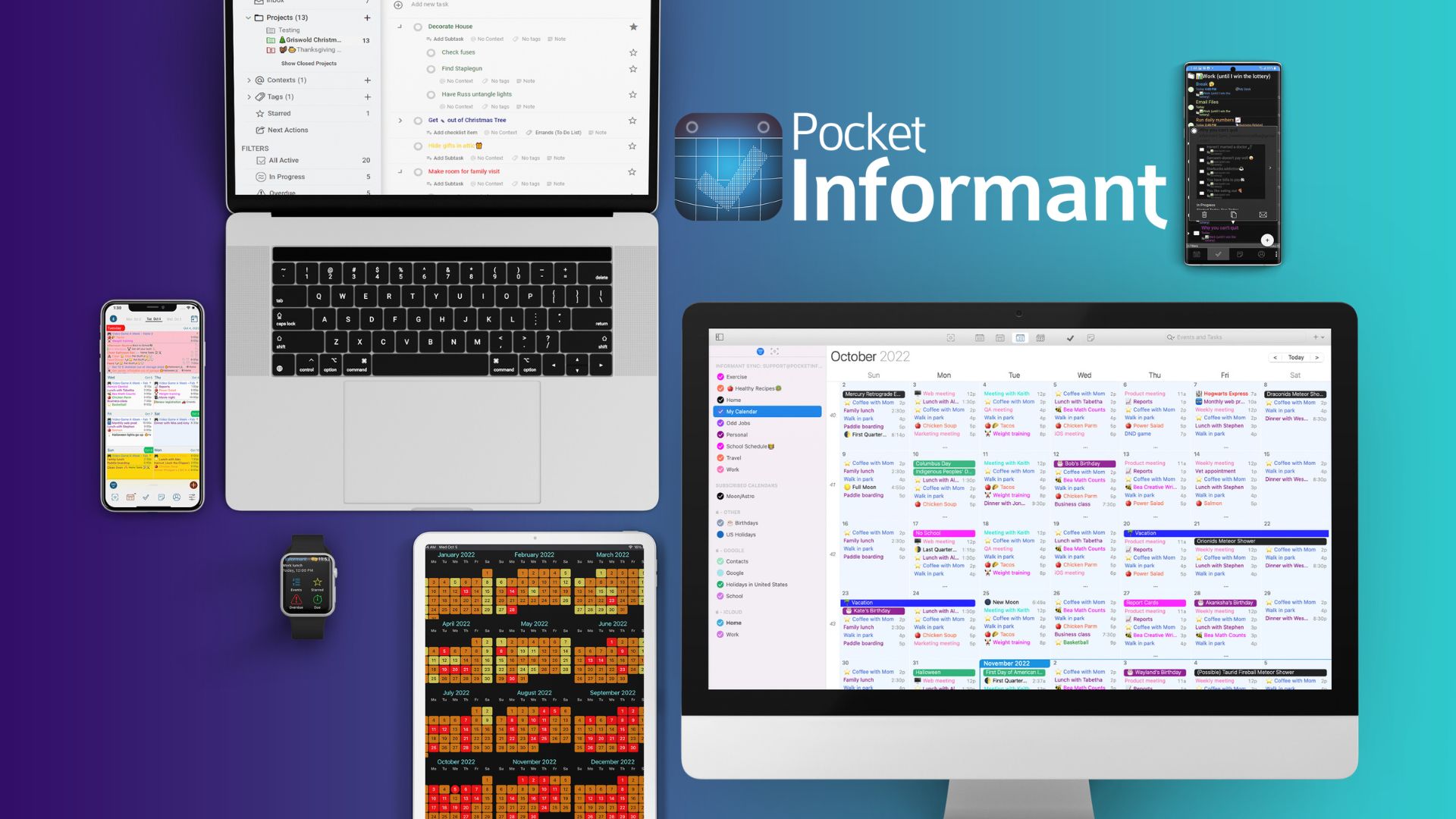
Day separators on the Weekly View are much too high (thick).
The Day separators on the Weekly View are much too high (thick). They reduce the number of events that can be seen. It doesn't need to be that thick to press on it if needed.
If you feel some users like the Day of Week name that thick, you can build it both ways and allow a menu Settings selection to choose which view style the user wants.
 Barry Furman
shared this idea
-
Hi there,
Thanks for bringing this up! We completely agree that the Day separators in the Weekly View should be functional without taking up too much space, especially when you’re trying to view as many events as possible. The current thickness may be a bit overdone, and we can see how that could reduce visibility.
Offering a toggle in Settings to choose between a thicker or thinner separator makes a lot of sense and would give users more control over their view. We’ll definitely consider this as a potential update to improve customization.
Thanks again for sharing your thoughts—we’re always looking for ways to make the experience more user-friendly!
