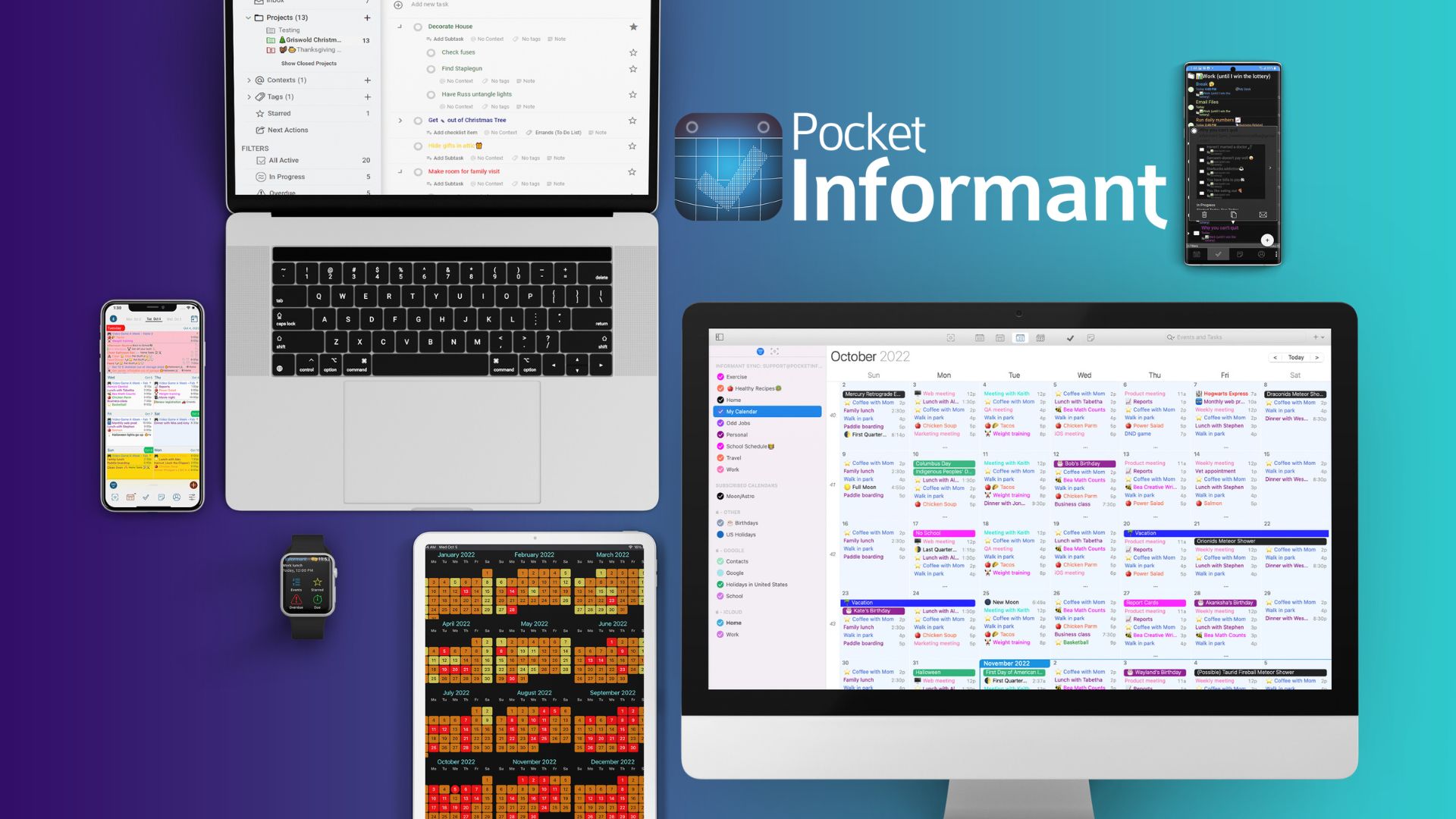
Update the aesthetic of the interface. Would love a more matte look with neutral colors
Update the aesthetic of the app, with a more matte look (ie- Todoist) and neutral colors
 gary wilson
shared this idea
-
B Srikumar commented
Hi.. It is important to have a better look and feel - options to change background colors etc.. Planmore is a great app as an example.. how clearly the planner is organised into sections, how calendar and tasks can be viewed at same time etc - one can see this app as an example to improvise..
-
 Bob
commented
I hope they never ever ever do this. It would be a waste of time.
Gary you should be embarrassed you asked for this with so many other features out there.
-
 Kent Bjornn
commented
I *much* prefer the colors available with the various tags. Please do NOT remove the ability to show colors. Bland & dead colors, as apparently suggested, are bad for ease of communication. Our eyes see color, allow us to use color.
-
 Thomas Zobl
commented
But please allow users to keep the current "high contrast" look as well.
-
Thanks so much for your feedback—it’s always great to hear from users who are thinking not just about functionality, but also how the app feels to use.
We’ve heard similar thoughts from others who are looking for a more modern, matte aesthetic with neutral tones, and I completely understand where you’re coming from. Apps like Todoist do a great job of creating a calm, focused visual environment, and it’s something we’re definitely keeping in mind as we plan future design updates.
We’re exploring some visual refinements that bring more polish and flexibility to the overall look and feel of Pocket Informant, and your input helps us shape that direction.
Thank you again for taking the time to share your thoughts—and for being part of the Pocket Informant community. We truly appreciate your support.
